During the development of Metro, the Washington Metropolitan Area Transit Authority considered giving each station its own pictogram. Fairly late in the game, the plan was shelved.
Trains are Awesome, a YouTube transit channel, revisited this idea in the video “What if the DC Metro used Pictograms?”
Early Metro wayfinding
Massimo Vignelli of Unimark designed the Metro station style guide (Ghosts of DC), not long after coming up with the now iconic New York subway signage (Ceros). When it came time to design the map, WMATA selected Laynce Wyman1 though. He was advised to retain the the Vignelli theme. Wyman was best known for the 1968 Mexico City Olympics. Following that, Wyman designed the Mexico City Metro logo, icons and wayfinding.
Wyman planned to use icons for DC as well, but according to TRA, Vignelli provided unsolicited advice to WMATA – “don’t.” WMATA listened and after half a century, the Metro map and wayfinding have been iconic to the National Capital region.
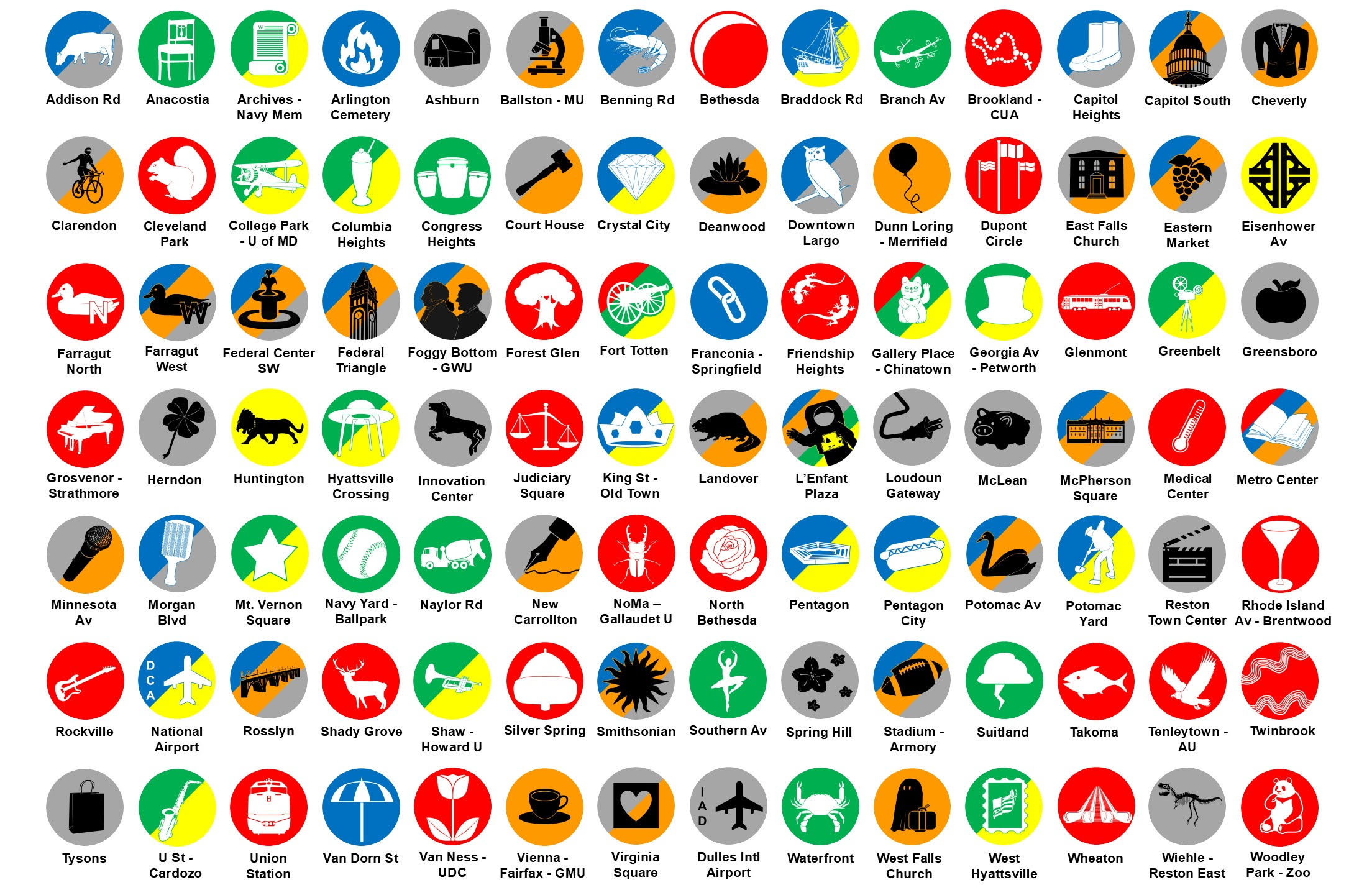
TRA spent much of 2025 revisiting this idea and coming up with a new collection of station pictograms.
Video
My reaction
Aside from the summary of the early history, TRA shares a personal use case for iconography – being asked by non-English speakers how to get to Dulles Airport. This supports his argument – some stations already have supplementary signage with an airplane icon and the airport code posted.
For what it’s worth, I have never been asked by a non-English tourist how to get to an airport while riding Metro.23
Coming up with 98 different icons is challenging, particularly the farther out the line goes. It’s ambitious project and in addition to sharing it in the video, there is merchandise.4
He got the layups for Anacostia and Tysons Corner, plus Virginia Square is clever. The Pentagon City hot dog hits close to home. Or at least, it used to…
On the whole though, I lean against pictograms for Metro stations. I side with Vignell’s minimalism approach here. While some pictograms could become iconic neighborhood symbols5, 98 seems unmanageable. The counterpoint is Mexico city has almost exactly twice as many stations with unique pictograms. I think it would make everything cluttered though and would be challenging to come up with pictograms for stations like Franconia-Springfield and North Bethesda6, etc.
TRA make a valiant attempt and I salute the effort.
What about you? Share your thoughts on what ever social media platform led you here.
Footnotes
- Wyman later revisited the map to include the Silver Line. ↩︎
- Although, the last time in New York, I was asked how to get to Carnegie Hall. I didn’t say “practice” though. I realized my error in about 5 seconds. Is it any wonder I haven’t been back? ↩︎
- I used to be the type of person who got the “do you work here?” in certain stores too… ↩︎
- Thom from TRA shared the feature image with me – if you want to see all of them, you need to watch the video. Or visit the store… ↩︎
- Metro station t-shirts have been available for sale in some form or another for 20ish years I have never seen one in the wild. I have seen New York subway t-shirts, in and outside of that city and even own one. ↩︎
- formerly White Flint, but spirtually…Rockville ↩︎