Since October 2022, I have traveled on subway systems that were new to me – Chicago’s L and Philadelphia’s SEPTA. The experiences were a good reminder that Washingtonians are spoiled by our Metro system.
WMATA has the advantage of being planned after those first generation systems. Escalators, elevators that serve as system entrances and exits come to mind. The open stations and smoother running railcars are also easily taken for granted. This is intentional of course, as Metro was conceived as a monumental, modern system. The distinction surely cost more but was seen as pivotal to public by in.
2006: Q & A: The Great Society Subway
The early 20th century systems simply cannot retrofit themselves to be like Metro. There is a lighter lift that could improve the user experience though – station entrance signs.
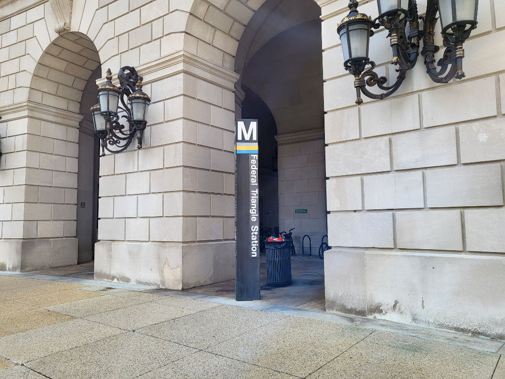
Pylons
Since the start of Metro, station pylons have guided riders into stations. The 12 feet tall signage is conveys information in an almost elegant way. Massimo Vignelli designed Metro’s minimalist look (Ghosts of DC).
The metro M illuminated and faces four sides. Directly beneath lines serving the station are displayed. The station name is posted. It’s intuitive and has become part of the national capital areas visual identity. Some people, including one of my co-workers, wear Metro pylons Halloween costumes. WMATA even got a bit of earned media recently for offering replica station pylons for sale.
Why isn’t every system doing this?
Here’s how other subways systems I have used handle their entrance signage. I’ll argue none of them are as good as a traditional Metro pylon.
Philadelphia

Not bad, Philly, the line name is there, but not every subway station (SEPTA or PATCO) has these.
I recently learned SEPTA is updating their signage and wayfinding (Philly Voice). Good for them, that’s going to be a big improvement. I’m not sure about PATCO though.
2023: A cursory look at Philadelphia’s SEPTA regional rail, subway and PATCO
Chicago

I can cut the CTA a little slack – most of the stations are elevated and the entrances are sufficiently conspicuous with additional signage means so you can’t miss it. A pylon might be overkill. You still have to go all the way to the entrance to get the details though.
The actual subway stations in The Loop have a pretty distinct entrance too – pretty good.

2022: CTA Observations
Boston

Boston’s T signs are iconic but those signs don’t have any additional information until you get to the actual entrance.
My understand is the T has much, much bigger problems to deal with for the foreseeable future.
2010: MBTA: Bus rapid transit is still a bus and the quest for a “T” mug
San Francisco

There are signs for BART and MUNI, but no indication of which lines or station name.
Maybe it’s changed in 16 years…
2007: Riding San Francisco’s rails
New York

I can’t imagine New York would even go to pylons. I suppose the green and red balls at entrances are good enough and Vignelli’s Helvetica signage is the most iconic in North America. Plus, New York isn’t going to make too easy for people to use the system.
Montréal

Société de transport de Montréal has a simple, basic logo for its MÉTRO – a down arrow. It’s pretty much always blue, regardless of line color. I think it should match the line color.
The métro symbol – STM
Updating station signage and…pylons?

Metro has added additional signage to some transfer stations, including L’enfant Plaza. Cardinal directions are being used and airport abbreviations. Vignelli may cringe, but it helps people get where they are going.

Not only that, WMATA labeled exits A, B, C – which is very helpful.

The big change though, is the new look of the pylon. Instead of the traditional same on four sides pylon, this new look has the line colors as circles on every other side. The station name is on the other two sides.
It feels more cluttered, less elegant and understated. I think it’s a downgrade, but I’ve been riding Metro since I was 9 years old, so I’m not necessarily the target audience. Still, it’s better than the other transit systems I have shown, if not as iconic any more.
Now, if we could just stop the cancellation of my preferred bus line, I’d really be happy.


